Monday, April 12, 2010

Artist # 19 Christian Boltanski

The first time I looked at Christian Boltanski's work I immediately knew it was something to do with the holocaust. Before I actually saw this picture, I just saw a very small version of it, it looked kind of freaky, but then I opened it up and saw that it was kids from the holocaust and it became something sad.
It looks like hospital cords connecting the children together and strung around to represent the life of them. To me it shows that these kids were once living, but now they're just a picture on the wall. The cords are placed all around each picture/head of the children and then are connected to each other below.
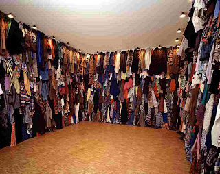

This looks like it's representing all the clothes from the Jews before entering into the concentration camps. (I haven't read the information about Boltanski's work yet). I've been to the Holocaust Museum in New York (I think) and they have heaps of shoes from the victims in the camps. This reminds me of that. The only thing is that these clothes don't look very old, so i'm assuming they're not the real clothes from back then.


Here, it almost looks like a combination of the first piece with the second piece. There are folded clothes placed beneath the photos. Something that's different here is that there are lamps placed over each photo that's illuminating a little circle on each face. The cords come down into the clothes. I'm not sure what I get out of the lights.

The last piece is different from the rest. I wasn't really sure about this one, but it looks like it's supposed to be scary.
There's some kind of wire contraption with skeletons hanging off, like they were people who were hung. There are also heads with weird long noses, maybe representing liars? I see mean looking faces and scared looking faces also. The wire contraption and everything is in the center of a room, small and is illuminated as shadows on the walls of the room.

I read that Christian Boltanski's work is obsessed with death. That didn't surprise me. He works with social, economic problems as well. I feel like my assumptions about this artist were close to what he is about. His work seems to be what it is, death.

Artist # 18 Albrecht Durer

I've learned about Albrecht Durer in art history. He's known for his prints. He's very talented and skilled when working with prints, but also with watercolor. His Great Turf is done in watercolor. It's so realistic that botanists could go in and know what each plant is. Now saying that, doesn't sound like such a great thing, but I think someone is talented if they can render nature in that way.

In class we learned that Durer believed, whoever could successfully draw nature had it. He thought that if you could do that, you were a talented artist. Nature must be pretty hard to draw in a realistic way if he made a statement like that.

His prints are so detailed. He also adds in nature and landscape in with them as well. In his Knight, Death and the Devil He is showing this knight strolling through untouched and not scared of the devil because he's wearing the full armor of God, (from the bible).
I was looking at this print closely and the detail really is amazing. He draws in the details of the tree bark and the land all around. You can see off in the mountains the tiny village, but the detail in the land is what stands out to me. Making something like this, with this much detail looks like it would take forever. I'm not sure how long it took Durer, but i'm sure it wasn't easy.

He created a print of Adam and Eve that's very different from other pictures of Adam and Eve. He put them in the forest looking background. Normally Adam and Eve are standing by the one tree, but here he placed them in the midst of many trees.
Again the detail here is crazy. The bark of the trees, the individual leaves and curls of hair. It's said that Durer wanted to create the perfect human bodies as far as proportions for Adam and Eve. That's because Adam and Eve were the first humans created, so it's only logical. When I look at this, I don't think that those are the perfect proportions. Eve looks very weird. It's kind of like a woman/manly body with a tiny manly looking face.

To finish off, here is one last example of Albrecht Durer's work:

Sunday, April 11, 2010

Museum Project

I've been trying to think of ideas for our last project, and have one so far, but it's not complete yet.

I was really confused when we were first given this project. I didn't understand if the whole class was working on one project together or if we're all doing our own displays or what. It wasn't until class on Thursday that I, and I think everyone else, really understood what we were doing.

I like that we can collaborate with other students. I think that will help a lot because it was really overwhelming when we first received the assignment. It would be a lot of work to do something on your own. It's also kind of a bummer for those whose proposals aren't chosen, because then you might get stuck working on a project that you don't like or care about.

I need to have my idea more thought out by Tuesday, but right now i'm thinking about doing something with women. I want to do something that shows the world view on women. How we are perceived, what guys think about girls/women, the images that we see of women and what young girls strive to be. I'm not sure of the exact things I want yet, so it's still very broad. I also don't know exactly how I would set this up. I could use quotes, interviews, pictures from magazines, the internet, etc. I was also thinking about eating disorders because that can tie in with female imagery and I know someone close to me who has an eating disorder and that the ratio is about 1 in 3 girls will struggle with an eating disorder. It's so sad and I think much of it comes from the images that we see and the expectations woman feel they need to live up to. I was also thinking about doing more of a historical take on it. Kind of like the changes that woman have had on history, famous women, and how they looked, to show that many of the woman who made the big changes in our world were not these perfect looking people.

I'll keep thinking and developing my idea for class on Tuesday. Honestly I don't think anyone would really want to go with this idea because it is just about women and there are many males in the class who probably wouldn't want to go with this idea. Also everyone else has their own ideas too, so we'll see!

Artist # 17 Ann Hamilton

Ann Hamilton seems to work with multiples. In many of her works I see that she used multiples of the object. In her piece, Indigo Blue she used blue cotton clothing. It makes sense because in jeans there is a wash named Indigo. I'm guessing it's the same, but maybe not.

I couldn't find the name or really any information on this:


Ann Hamilton is known for her installations, so i'm guessing that this is some kind of instillation that you can walk through. (Kind of obvious with a picture of a person walking through it). It looks like the windows have a pink film over them to give a pink glow throughout the room. This piece is in a large long, rectangular shaped room with these windows lining the whole thing. I'm not really sure what her intention of it was, but I like that it's interactive with the viewers.


This photograph is apart of her "untitled (body object series)" She has a series of pictures of herself interacting with everyday objects. She attaches the objects to some part of her body and photographs it. It then looks like she has grown this object from her body, or that the object has grown a body.


This last image is titled The image is Still.
It's suspended charcoal hung by thread with a video image to go with it. Other than that little bit of information I couldn't find anything else on this. I'm trying to figure out why it's titled that, but i'm not getting anything. Maybe it all ties together with the video. Again she used multiples of charcoal here. It catches my eye because of that. I think I would need to see Ann Hamilton's work in person to really understand it and enjoy it.

Wednesday, April 7, 2010

Artist # 16 Fred Wilson

I read, here, that before Fred Wilson began his own work, he worked in museums in New York. He worked at the Metropolitan and the Museum of Natural History. He was a freelance educator in these museums. He didn't like the way the museums were portraying the items displayed and I think thought they could be misinterpreted because of that. So he would redo some of the displays in new ways that would allow the viewers to see what is shown without anything blocking the view or getting in the way, (figuratively speaking).

Some of Fred Wilson's work is very different from what i've seen with other artists. I knew that he was some kind of "museum artist" because his name is from the handout from class. If I looked him up on my own without knowing that, by just looking at his pictures I might be able to tell that is his main focus. There were a few that didn't seem to be like a museum display like this chandelier:

It just looks like an antique item, and i'm not really sure what it is about. Maybe it was a chandelier from some really important person's house and so that's why it would be displayed in a museum.


These pieces are made of wax. It's hard to find information on the individual works instead of Fred Wilson as a person. The pictures don't really have any information with them. I know that his work is trying to break down the barriers of the lighting, colors, shapes, displays of museums to create a different meaning. When all those elements are changed it changes the meaning of the works.

Here are a couple more pictures of his work:

Monday, April 5, 2010

Artist # 15 Caravaggio

Caravaggio was different than most painters of his time. He did things the opposite of how everyone else thought they should be done. I watched a video on him in class and he seemed pretty crazy. He had a terrible temper that actually led him to kill a soldier. He was a wanted man and it led him to paint this:
It's his version of David. He used this painting to give as his pardon, but ended up dying before it was received. Instead of David holding Goliath's head, he's painted himself as goliath. He is the monster and is offering himself through this painting. I think it's very clever.

Caravaggio's paintings are all dark. You can recognize his style pretty easily. It's as if the figures are coming out of the darkness. He painted people that other famous painters didn't. He was a poor man and so he would use the peasants off the streets. His models were just regular people. Probably his most famous painting is The Calling of St. Matthew
Here Jesus is completely in the dark, you wouldn't even know it's him except for the slight halo you see above his head. His finger is lit and draws your eye straight to Matthew. The light coming in also gives a diagonal that the hand follows. They're in this dark alley or somewhere. It's not some grand place and grand painting, but it's very powerful.

The expressions that Caravaggio uses are great too. The people in his paintings actually look sorrowful if that's what he meant. Here you can see it in his Entombment

I get a certain feeling whenever I see these paintings. I think it's from watching the film, but they are way more powerful when I see them. Caravaggio always went a step further with his paintings. In Doubting Thomas Caravaggio shows the actual finger of Thomas in the flesh. He chooses to really make a statement when he paints something. The expressions on all the faces are so detailed with the wrinkles and everything.


Unfortunately, Caravaggio died because of his mistakes, but he made a collection of great paintings and is still one famous artist.

Sunday, April 4, 2010

Artist # 14 Yoshichika Takagi

I came across this artist in another blog I was looking at. You can look at it here. Takagi's big project was "House K," a house in Japan. I've never seen a house designed in the way this one is, but I really like it. I honestly don't know if I would ever live in a house like this, but I always like looking at them. It's a little too "wooden" for me.


I couldn't find out a lot about this artist, but I would still consider him/her? one. Yoschichika attended Hokkai-Gakuen University and Architectural Association School of Architecture. I found this from the website and their blog. This person looks like this house was their first big thing they accomplished and it's getting recognized all over the world, so i'm sure we'll see more work from him.

He is definitely a minimalist. His house is minimalist and some other works that came up on google images are minimalism pieces, such as these:


Because there's not a whole lot of information about this artist, i'm not even 100% that these pictures are his work because they are from google images. They're all I could find though and so I'm hoping they're right. I enjoy this type of art much better than say Anish Kapoor's. I like architecture and definitely consider it art because you're making conscious decisions about where you're placing things and how it looks in the end.